
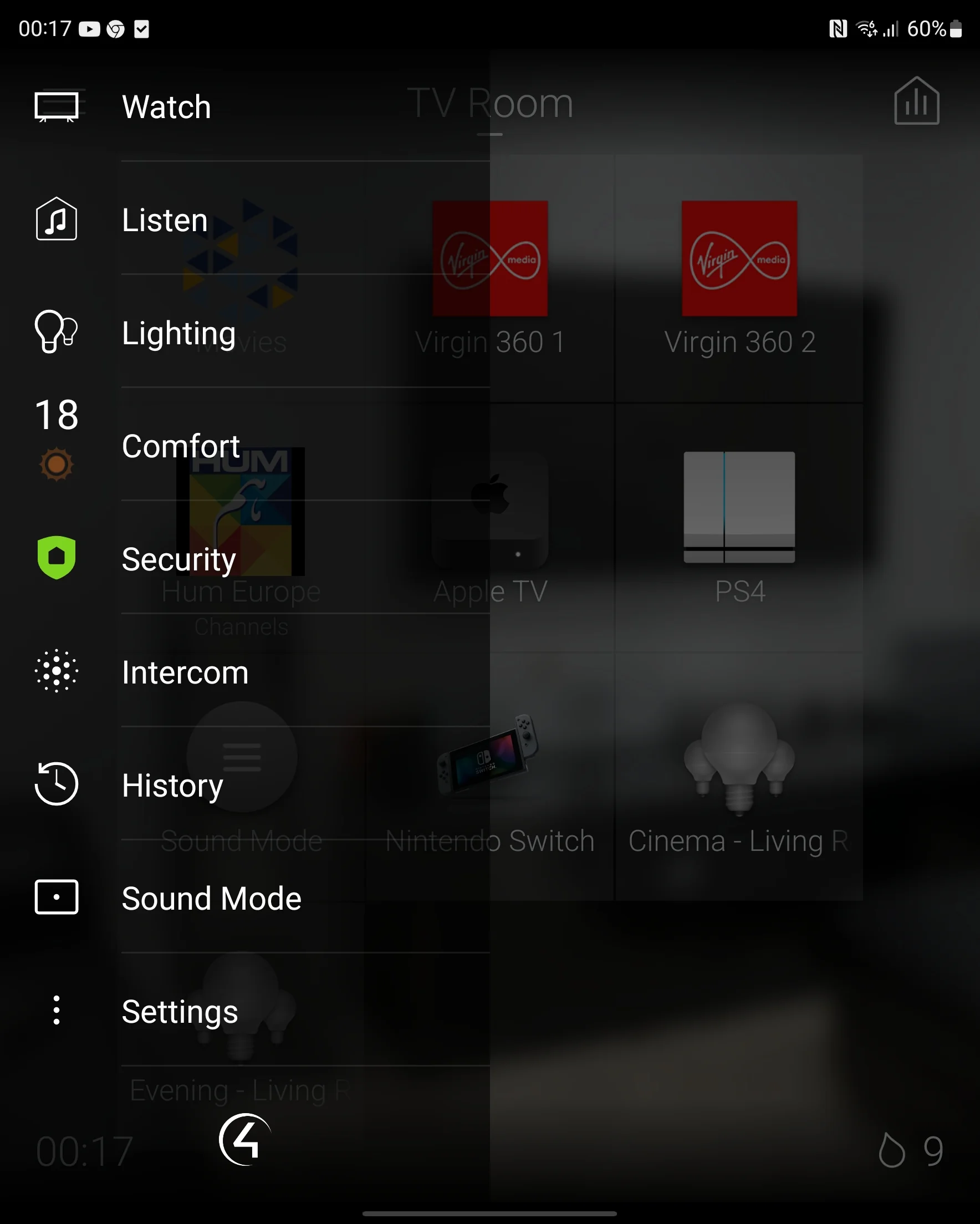
Control4's OS3 platform has matured significantly since its debut, and the latest update brings a welcome refinement to everyday navigation: a completely redesigned fly-out menu. For homeowners who interact with their Control4 system daily — and that is, by definition, every homeowner with one — this is a meaningful improvement to the user experience. At MK Iconic Solutions, we have deployed this update across our client base, and the feedback has been universally positive.
What Has Changed: A Complete Visual Overhaul
The fly-out menu — accessed by tapping the three-line icon in the top-left corner of any room screen — has been entirely redesigned. New icons are cleaner, more legible, and use a consistent design language that aligns with the overall OS3 aesthetic. The layout is more spacious and easier to navigate at a glance. Typography has been refined for improved readability on both touch screens and mobile devices, with larger tap targets that reduce mis-presses.
The previous menu had been largely unchanged since the original OS3 release. While functional, it was showing its age compared to the visual refinements elsewhere in the platform. The update brings the navigation in line with the polish and sophistication that modern users expect from premium interfaces. The transition animations are smoother, the hierarchy clearer, and the overall impression is one of a system that has been carefully considered rather than merely functional.
Why Does Smart Home Navigation Design Matter?
The fly-out menu is the primary navigation tool for switching between functions within a room. Lighting, climate, entertainment, security, and shading controls are all accessed through this panel. In a complex installation with dozens of controllable devices across multiple rooms, efficient navigation is the difference between a system that feels intuitive and one that feels laborious.
Consider the daily interactions: checking the security camera feed before answering the door, switching from music to television in the evening, adjusting the thermostat from the bedroom, reviewing who is at the gate via the intercom. Each of these actions routes through the fly-out menu. A cleaner, faster interface means less time navigating and more time enjoying your home. For households with multiple users — including guests who may be unfamiliar with the system — intuitive navigation is the difference between independence and frustration.
Personalisation and Room Context
The updated menu adapts to room context more effectively than its predecessor. In the cinema room, entertainment and lighting controls are prioritised. In the bedroom, climate and lighting take precedence. In the kitchen, music and intercom are prominent. This context-awareness is configurable during system programming — we work with each client to ensure that the most frequently used functions in each room are the most accessible.
The personalisation extends to visual branding. Room images — often photographs of the actual rooms in the client's home — provide immediate visual context when navigating between spaces. Favourite scenes and devices can be pinned for one-tap access from the menu. The result is a navigation experience that feels personal to the household rather than generic, reinforcing the sense that the system was designed specifically for them — because it was.
Touch Screen and Mobile Parity
One of the most welcome aspects of the update is improved parity between the dedicated touch screen interface and the mobile app. Previous versions showed noticeable differences in layout, responsiveness, and visual polish between the two platforms. The updated menu ensures a consistent experience whether you are using a wall-mounted T4 touch screen, an iPad, or your smartphone. This consistency is particularly important in households where different family members have different preferred control methods.
The mobile app has also received performance improvements alongside the visual refresh. Menu transitions are faster, room-switching is more responsive, and the overall experience on both iOS and Android is noticeably smoother. For clients who primarily control their home from their phone — and an increasing majority do — these improvements translate directly into daily satisfaction with the system.
Accessibility Improvements
The redesign incorporates several accessibility improvements that benefit all users. Increased contrast between text and background improves readability in varied lighting conditions — important for wall-mounted screens that must be legible in both a brightly lit kitchen and a dimly lit hallway. Larger interactive elements reduce the precision required for touch input, making the system more comfortable for users with reduced dexterity or for those operating the interface one-handed.
Font sizes have been optimised for viewing distances appropriate to each interface type. Wall-mounted screens, typically viewed from arm's length, use larger typography than mobile devices viewed at close range. This attention to the ergonomics of interaction is characteristic of Control4's design philosophy — and it distinguishes the platform from competitors that treat the user interface as an afterthought.
How to Get the Update
The updated menu is available with OS3.3.3 and later. Ensure your Control4 system is running the latest software, and update the Control4 app on all phones and tablets. If you have not yet upgraded to OS3, contact us — the migration is straightforward and the benefits extend far beyond this menu update. The latest OS3 releases include improvements to streaming integration, voice control, and energy management that collectively represent a significant upgrade to the daily experience of living with Control4.
Our Perspective
In the world of home automation, incremental improvements to the user interface matter enormously. The systems we install are used hundreds of times per day by every member of the household. A faster, cleaner, more intuitive navigation experience compounds into a meaningfully better relationship between the homeowner and their technology. The updated fly-out menu is not a revolutionary feature — it is something better: a thoughtful refinement that makes every interaction with your Control4 system a fraction more enjoyable. Over thousands of interactions, those fractions add up.
Frequently Asked Questions
Do I need to do anything to get the updated menu? If your Control4 system is running OS3.3.3 or later, you already have it. Ensure the Control4 app on your smartphone and tablets is updated to the latest version. If your system is on an earlier OS3 version, contact us to schedule a remote update — the process takes approximately 15 minutes and can be completed without a site visit in most cases.
Can I customise what appears in the fly-out menu? Yes. During system programming, we configure the menu for each room to prioritise the functions you use most frequently. In the cinema room, entertainment and lighting controls are at the top. In the bedroom, climate and alarm settings take priority. Favourite scenes and devices can be pinned for one-tap access, and room icons can be customised with photographs of the actual rooms in your home for instant visual recognition.
Does the update affect my existing scenes and automations? No. The fly-out menu update is purely a visual and navigation improvement. All existing scenes, automations, device configurations, and programming remain exactly as they were. The system operates identically — it simply looks better and navigates faster. There is no risk of disruption to your existing system functionality.
Can I try the new interface before committing to an update? If you visit our showroom or schedule a demonstration, we can show you the updated interface running on both touch screen and mobile platforms. The improvement in navigation speed and visual clarity is immediately apparent, and we have never had a client choose to remain on an older version after seeing the update in action. For existing clients, the update process is straightforward and typically takes less than fifteen minutes via remote access.